We're a team of wedding, elopement and portrait photographers who put community over competition. We provide tips and resources for Photographers looking to up-level their businesses.
We're here to help When you join The Photography Business Academy
Alt Text for Photographers – Enhance Website Accessibility
Want to get alt text for your photography website right? Read on!
Alt text (alternative text) is hugely valuable to implement into your web pages that contain images and other graphic elements. This is because with alt text, it can help your website be more friendly to search engines, as well as users with slow internet speeds and some visual disabilities.
Alt text for photographers is particularly important because of how image heavy their websites typically are. Unlike other industries which may use photos sparingly, these images take center stage as they are a major component of photography brands and pages like portfolios and blog posts.
In this article, we’re going to be covering more about what alt text is and how to use it effectively on your photography website.
What is Alt Text?
It’s likely that since you are here, you already have some idea of what alt text is.
To make sure we’re not talking past each other, we want to share a quick summary of what it is and how it will be a benefit to implement into your website.
Alt text is an HTML attribute for the image that provides a text description of the image. Most commonly, alt text can be displayed in place of images in certain circumstances.
Common reasons for real world alt text use include:
- Someone has a slow internet connection and images do not render. Images will be replaced with the text – which is smaller in size and easier to render.
- Users have visual impairments that make viewing images more difficult than text. For example, some forms of color blindness may make it more difficult to assess an image than the alt text description.
- Some users may be blind and rely on screen reading devices. Screen readers cannot describe an image but can read descriptive alt text.
As you can see, there are many benefits to using alt text on your web pages – even beyond just SEO itself. But, the search engine implications shouldn’t be ignored. Let’s talk about that now!
How Alt Text Improves SEO for Photographers
While we have seen many ongoing conversations online debating whether or not alt text is a ranking factor for search engines, it’s clear to us that alt text is beneficial for SEO.
Here is why:
First – search engines are constantly making changes to prioritize websites that are better optimized for user experience.
Some aspects of UX take into consideration people with disabilities like visual impairments.
Google sent a strong signal to website owners a few years ago when they implemented an entire Accessibility category into the popular Page Speed Insights tool – which now checks for not only page speed and SEO factors, but accessibility factors, too.
Second – search engine crawlers cannot decipher what images are (at least not yet), but they can read text.
Providing alt text that is descriptive of the images on your web pages will be highly valuable for search engines because they will be able to “see” and more importantly interpret more of your content.
For the purposes of SEO, you can create strong alt text that provides effective descriptions for users who need it, and further optimize it to provide search engines with additional reasons to prioritize your content for certain keywords and localities.
Let’s talk more about that now!
How to Write Alt Text for Your Images
At it’s core – good alt text should provide a description of what is in the image.
It’s not too much more complicated than that (don’t let anyone tell you differently!).
Your focus should not be to stuff keywords into the description if they do not fit naturally. This is one of the big errors with alt text for photographer’s websites we see quite often!
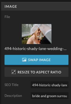
We cover the topic of alt text in a lot of details and go in even more detail with walkthroughs and examples to help you create this for your site in our SEO and Blogging Course for Photographers.
Alt Text Best Practices for Photographers
Think of the best practices we’ve laid out below to be a little cheat sheet to help you write alt text for your photos more easily:
Keep alt text short and descriptive.
We generally recommend around 150 characters or less, though there is no hard cut off.
Only add alt text to non-decorative images.
Many photography websites use graphical elements as simple decoration – you do not need to include alt text on those. You should prioritize adding alt text to images with more meaning for someone to take away.
You do not necessarily need alt text on all your images.
We suggest putting alt text on images on all your “core” website pages (like Home, Portfolio, About, etc.). This is because these pages are typically more restrained and it’s less of a time burden. We also recommend using alt text on photography blog posts, but if you are blogging weddings or photo sessions – it’s not necessary to add alt text to every single image.
Do not include “image of” in your description.
This is for the sake of keeping your alt text more succinct. For people using screen readers, this will already be stated.
Do not provide info that is included in body text near the image.
This is easy to avoid if you focus on simply describing what is happening in the image.
Add context to your alt text descriptions.
When it makes sense, you can take a simple description and give it specific meaning by providing context – such as by mentioning the event, client names, local names (such as a wedding venue, park, town, state, etc.).
All this information helps provide your audience with more valuable information. As most photographers also operate as local businesses, context clues are also useful for both users and search engines to reaffirm the locations they serve. This also becomes a way to pretty often naturally incorporate your SEO keyword (or a close variation of it) in the alt text, without making your alt text about the keyword.
Let’s take a wedding photo as an example:
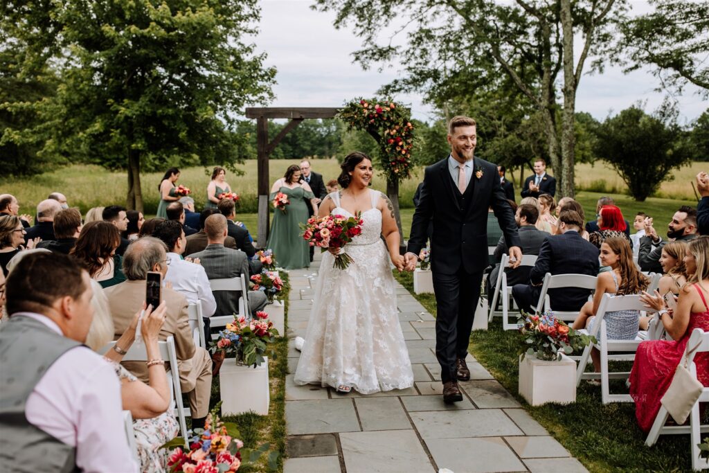
In the image above, we could approach alt text a few different ways (and none are inherently wrong, either!):
- Example 1: A bride and groom
- Example 2: A bride and groom at The Farm Bakery & Events in Pennsylvania
- Example 3: The Farm Bakery & Events in PA with a recently married bride and groom walking while wearing a white dress and blue suit with florals and guests behind them.
Can you guess which example is the most impactful for users and SEO?
Let’s dig into some more examples now!
Examples of Alt Text for Photographers
While alt text in theory is fairly easy to understand, many photographers struggle with actually applying it to their content. This might be because alt text is virtually invisible…and like many things with SEO, you don’t see the direct results of your efforts until much later (if ever).
But – alt text contributes to better performance of your pages and blog posts overall, so the payoff will be there with consistency.
Writing the alt text is simple to start, but crafting better quality text that serves your users and search engines better takes a little practice.
Remember: creating alt text is a little bit subjective, and while there are some standard practices to follow, occasionally you may need to break the rules to provide the best result.
We have selected photos below and provide examples of possible alt text you could use for these images.
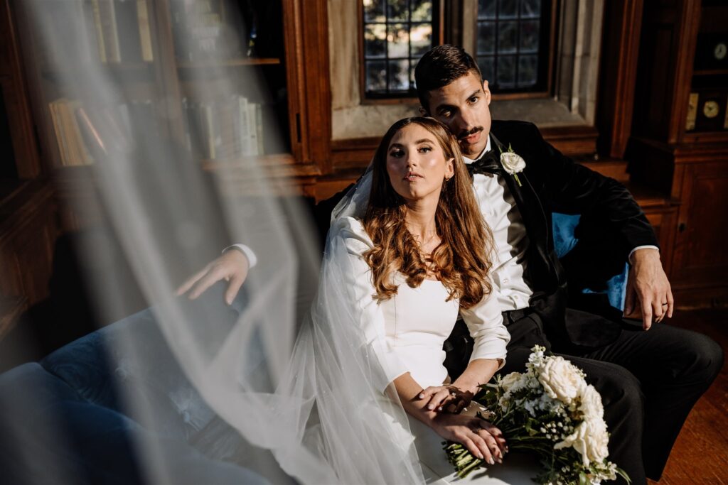
- Bad: Wedding at a venue in NJ.
- Better: Couple in wedding gowns sitting on a couch.
- Best: Kelsea and Phil sitting on a blue couch in the library at The Castle at Skylands Manor in New Jersey.
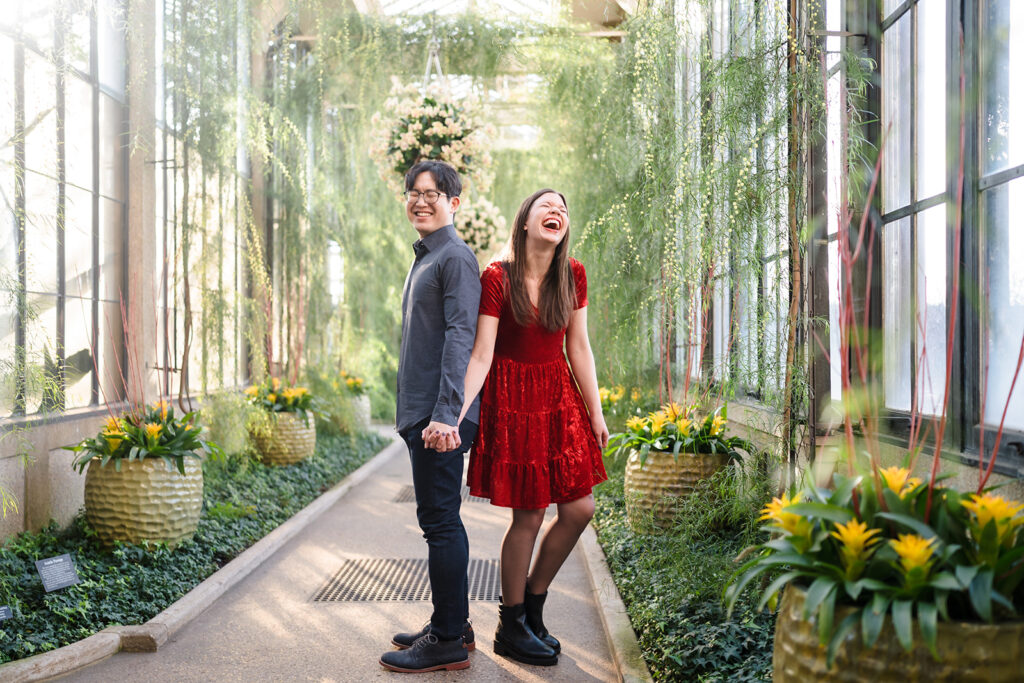
- Bad: Girl in a red dress at a garden center.
- Better: Newly engaged couple Kathryn and Dan laughing.
- Best: Kathryn and Dan’s having a laugh in Longwood Gardens flower filled arboretum.
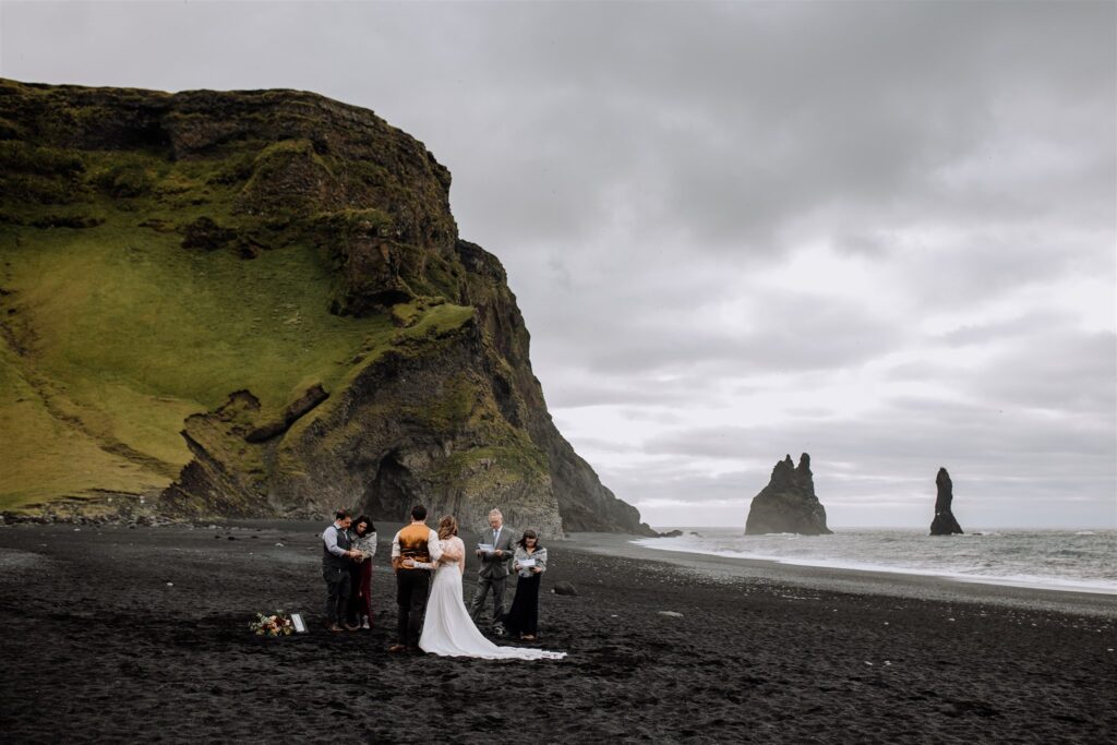
- Bad: Sea stacks at the black sand beach.
- Better: Marriage ceremony on a black sand beach in Iceland.
- Best: Marshall and Beth’s early morning adventure elopement on the black sands of Reynisfjara Beach in Iceland.
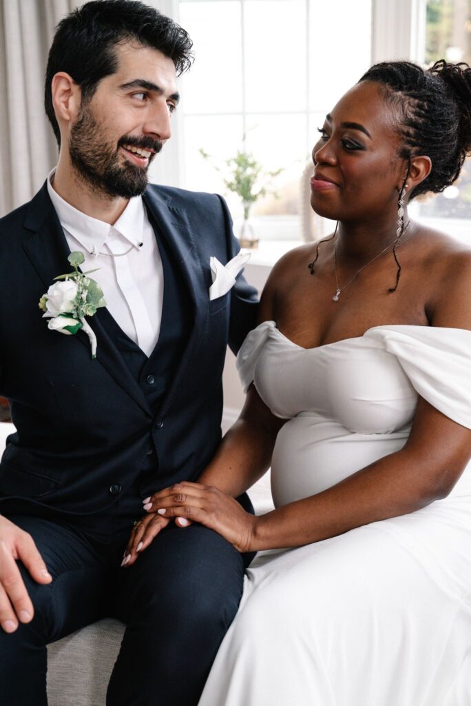
- Bad: Couple.
- Better: Couple in wedding attire looking at each other.
- Best: A newly married couple sitting together during Annie Cimmino’s wedding portrait shoot.
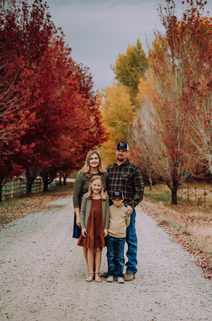
- Bad: A beautiful photo of the fall leaves.
- Better: A little family pose for a portrait with fall foliage.
- Best: Fall family session with Bellanet Photography in Idaho with vibrant foliage in the background.

- Bad: Professional looking woman.
- Better: A girl wearing a custom necklace.
- Best: Stylish woman wearing Militza Ortiz beskpoke initial letter silver pendant necklace.
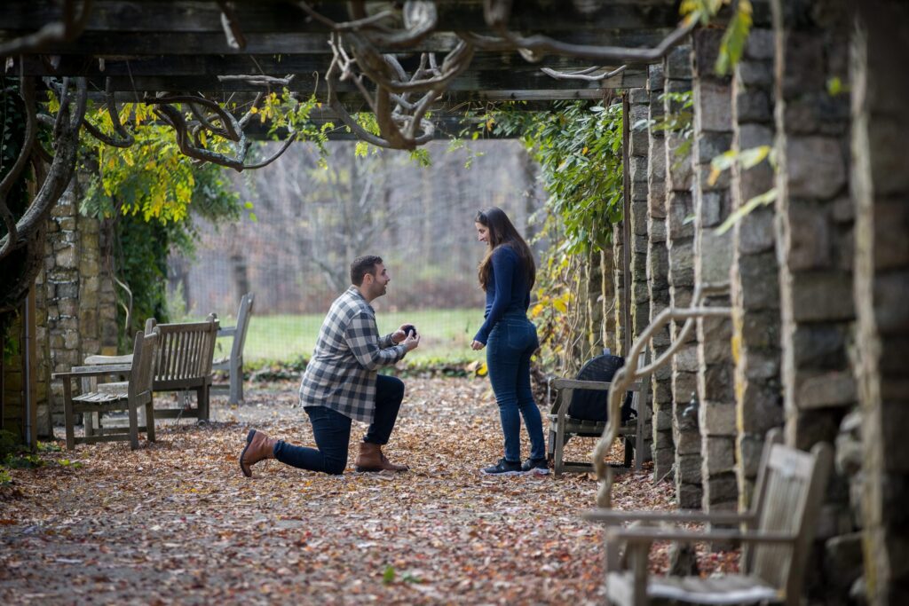
- Bad: Professional looking woman.
- Better: A girl wearing a custom necklace.
- Best: Dan’s wedding proposal to Sara at Cross Estate Gardens in Morristown, New Jersey.
What Makes Alt Text Good or Bad?
Good alt text describes what is happening in the image and provides context for the user.
It’s valuable to keep in mind what takeaways you’d want an audience to your website to know – especially if they are limited on what they can actually see on your site.
Providing descriptions of people and locations is a good starting point. When possible, include specific names or regions, since these localities may conjure up more specific visuals in your user’s mind. This is, in fact, one of the focuses of alt text – to provide a written description so the user can “see” the image in their brain.
Bad alt text simply provides a very limited or inaccurate description. If your description is very generic, it’s likely not great to help your users experience.
Another instance of bad alt text, especially for photographers with a lot of images on a single page, is reusing the same alt text on multiple images. This is not valuable for search engines, and will lead to users getting very frustrated as they see the same words repeated over and over again.
If you have many images on a page (especially when taken at the same location), select a few to provide alt text for and call it a day.
To learn more about alt text (and other aspects of SEO), we go in even more detail with walkthroughs and examples to help you do just that in our SEO and Blogging Course for Photographers, part of The Photography Business Academy 9 course library.

Honesty is a cornerstone of Shoot and Thrive, so we want you to know that some links in this post are affiliate links. This means we may earn a commission if you make a purchase—at no additional cost to you. We only recommend products and services we trust, have used ourselves, or have thoroughly researched based on industry feedback. Our goal is to provide solutions that genuinely help, whether they come from our direct experience or the collective knowledge of the photography community.
As photography business educators, we believe it's important for educators in this industry to be active photographers themselves. The images used throughout this website were taken through our photo studios - Hand and Arrow Photography and Marshall Scott Photography, except for stock images or if otherwise noted.
Turn Your Passion into a Thriving Business
Transform your photography business into a streamlined, profitable venture that gives you more time, freedom, and confidence.
With the Photography Business Academy, you’ll have a step-by-step guide to building the business—and life—you’ve always dreamed of. From branding to marketing, finances to client experience, we’ve got you covered.
Navigation
Shoot and Thrive is an ethically created resource for photographers needing mentorship, coaching, or business education. We believe in creating content that’s easy to digest and retain while incorporating educational best practices, so you gain clarity and confidence as a business owner.