


15 Website Design Tips for Photographers – Create a Better User Experience
Do you want a stronger website for your photography business? You’re in the right place!
Your website is one of the most important sales and marketing tools you have as a photographer.
It’s the place you funnel most traffic to – whether they find you through word of mouth, social media, or search engine optimized blog content. And with the right collection of information on display, it’s going to help pre-sell people on wanting to take that next step to reach out and work with you!
In this article, we are going to highlight some objective website tips that you can apply to your photography website to get quick results by making your site easier for users to navigate.
When we see these things in action on a website, they are helping to elevate a website into a converting machine!
While there are countless ways to improve your website, we’ve made our list to showcase some of the biggest “wins” you can unlock based on the biggest pieces of feedback we’ve been able to provide photographers we have worked with in the past.
If you are needing help with creating a better photography business website, check out our Website Course for Photographers, a part of The Photography Business Academy 9-course library.
Your Brands Influence on Website Design
Before we dive into our website design tips for photographers, I wanted to take a moment to highlight something really important to this conversation – the impact of your brand on your website.
Photographers (like any business, really) who have clearly defined brands make more sales and perform more consistently.
The creation of a website is made significantly easier when you are clear on who you are wanting to serve, have documented brand values and messaging, and have developed a cohesive visual brand (including fonts, colors, graphics, etc.).
By skipping the important step of developing your brand and just making a website, you will likely find yourself struggling not only with the site design, but to actually bring in the clients you are dreaming of…
If this sounds like you and you want some help developing a strong brand, check out our Branding for Photographers Course.
Let’s dive into the tips now!
Our Website Design Tips for Photographers
Tip #1: Understand the purpose of your pages
Every page on your website needs to have a purpose.
Put another way – you should have a clear goal associated with each page.
Ask yourself – if a user lands on this page, what do I want them to do from here?
Don’t just assume that people will naturally find their way to your contact page – give them the guidance they need!
For example, your Home page should be set up as a “filter” to move users to other, more relevant pages, so it should be set up to provide them enough information to take that next step…and present them with options for their next steps – like moving to a service page or an about page!
What purpose do other pages on your website have?
Can you think of it for each of the “main” pages you have like:
- Contact page
- About page
- Service pages
- Pricing page
- Portfolio page
Tip #2: Prioritize showcasing key content “above the fold” on each page.

Remember, the “above the fold” section (also known as the “hero section”) is the top most part of your pages that a user sees before they have to scroll.
Key information you should be adding here includes:
- Navigation information in your header
- Photos that are eye-catching and reflect your portfolio
- The type of services you provide
- Location information about the places you serve or are located
- Unique brand messaging
- A clear call to action, normally to contact you
Think of it this way – if your users computer froze and they weren’t able to scroll to check out more of your website, what info would you want to make sure is loud and clear for them to know about your business?
It’s so important because we have, on average, just a few brief seconds to make a good first impression or users are prone to leaving our websites. This is why this section is so incredibly important!
Tip #3: Place the main navigation at the top of a page

Users expect to see the main navigation at the top of the page – so make sure you are doing this as it’s foundational to website navigation!
The good news is that most of you will likely be doing this already since it’s pretty standard practice for websites.
And make sure you do not conceal the main navigation in a hidden menu (such as a hamburger menu) on desktop. This is a trend we see from time to time on websites, and it’s detrimental to user experience since it requires them to take extra steps just to access key information on your pages. I actually highlighted this exact problem in a recent website review I did for someone over in our free Facebook Group for Photographers.
Keep in mind, more steps tends to mean less conversions!
Tip #4: Place a logo at the top left (or center) of a header
This is the “natural” location for a logo, so let’s not break away from site design conventions on this.
You will also want to make sure your logo is clickable, so it always brings a visitor back to the homepage.
Tip #5: Use clear Call to Actions that tell users where they are going next

Clear call to actions would be things like “contact” or “contact me” – if your goal is to direct someone to a contact page.
Using phrases like “let’s work together” might be a little less clear and negatively impact your user engagement rates.
Another thing to keep in mind is to make your CTAs stand out by using unique colors and button boxes – this one change can have a massive impact on your website’s conversions!
If we use CTAs regularly throughout our websites, it makes it easier to filter people to the next pages that are important for them to explore as a part of their journey to taking that ultimate step of reaching out to us!
If you do anything on this list right now, adding and/or improving your current CTAs will have one of the biggest immediate impacts on your website’s performance.
Tip #6: Give users an action every time they scroll
Building off the last tip, let’s also use CTAs regularly to keep users engaged with your content.
We try to include CTAs roughly every time a user scrolls to a new section on our pages – this gives them so many opportunities to do something other than just read text and look at pictures.
Think about all of the places you can send people to – other core pages on your site, blog posts, and educational content when it makes sense!
When in doubt, providing an opportunity to go and contact you is always a good idea!
Like everything, there may be a time and place to break away from the advice we give, but you should have a good reason for it if that’s the case!
Tip #7: Provide clear actions at the bottom of your pages

Did you know that most of your users will not scroll all the way to the bottom of your pages?
If you have a good website, they should be getting redirected to other areas of your website before they even need to go this far.
BUT!
The ones that do go to the bottom may be really engaged with your brand and content, so don’t lose them!
Adding a dedicated CTA to contact you (or take some other action) right before your site’s Footer is a good choice if in doubt – give people something to do if they make it this far.
If you don’t, what ends up happening is, pretty often, they’ll just close out your website and go somewhere else. Don’t give them the chance!
Tip #8: Use your Footer as a secondary navigation to redirect users to other areas of your website without requiring them to scroll to the top.

If someone has gone this far on your page, your Footer should help them reorient themselves.
Great footers have multiple things going on including navigation links to your core pages, legal pages like your privacy policy, a clear primary CTA, branded messaging, additional photos and graphics, and (potentially) more.
But, at a bare minimum, this should be a space to provide navigation links for ease of reference.
You can also include links to your social media profiles here, but be aware that by doing so, you do run some risk of losing users to the infinite scroll social media. In the Footer, though, this has a lower impact than on other areas of your site.
Tip #9: Use color to help visually guide users through your website.
When you can, use distinct colors for specific parts of your website.
For example, on my website, all of my CTA buttons are orange.
All of my header text is reddish.
By having consistency in even a few of these small things, it makes it easier for people to navigate through my website.
It also allows the site to look more visually cohesive and “on brand”, which is a great thing to be able to say about a website!
Tip #10: Use responsive design so your site is friendly on desktop and mobile devices.
Always, always check that your website will work well for your users on mobile devices!
For my photography studio, around 70% of my site traffic finds me through mobile devices. Makes sense when you think about how often many of us are glued to our phones, right?
Consider this – if someone is visiting your website after finding you on Instagram, it’s highly likely they are browsing on mobile!
Tip #11: Avoid using low-converting site add-ons such as automatic image slideshows, autoplaying videos, and music playing in the background.
These things are not very intuitive for users, and can also pose some risk to decreasing your page load speeds, which will negatively impact your SEO (among other things).
Have anything like this on your current website?
I’d suggest nixing them as soon as possible!
They’re doing more harm than good!
Tip #12: Having links and buttons that change appearance when you hover over them can create more interactivity and engagement.
These are examples of some potentially great design elements that are also very aesthetically pleasing when implemented well into your website.
This draws attention of your user to key features (like CTAs or clickable links), without distracting their attention from things that are important (because things like CTAs are important!).
Tip #13: Improve site loading speeds to better user experience.
There are many things that contribute to having a faster website (and we talk about these more in our SEO for Photographers course), but the key takeaway is that faster websites tend to get better results.
The longer someone needs to wait around for your site to load, the more likely they will be to go somewhere else.
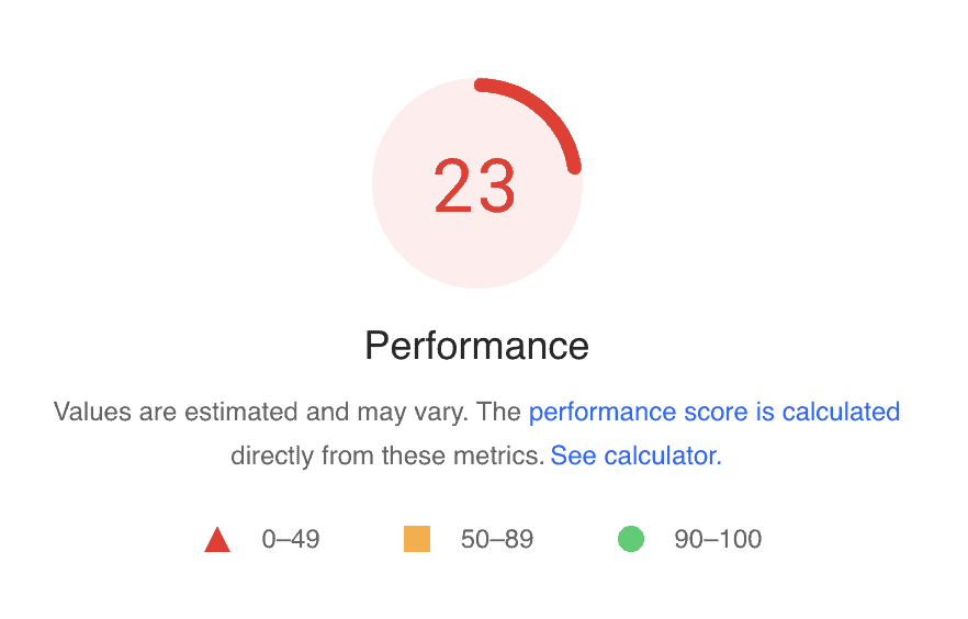
To check your page speeds, we recommend using Google Pagespeed Insights to see how yours is performing. We aim to have websites that are performing at, at least, a page score of 80 or greater.
Tip #14: Use lazy loading when possible so elements on your site load as they appear.
Lazy loading is a technique used by websites to only load content that is currently visible on a page, instead of loading everything on a page at one time.
How it’s achieved depends on your site platform.
For example – you can use a plugin that enables lazy loading on a platform like WordPress. A popular plugin like Yoast SEO can do this – you may just have to activate it in your settings!
Other site platforms like Showit have lazy loading built in, so it’s not really something to worry about if your site is hosted there!
Tip #15: Use readable fonts and font sizes.
For body text fonts, between 10 – 14px is typically a good size, but the specific recommendation will vary depending on the font as they all are sized and weighted a little differently.
If you are working on a desktop, if you can’t read your site from a comfortable sitting position (1-2 feet from your computer), you may need to increase the font size.
If you need to move in real close just to read the text, it’s too small.
Be mindful that script fonts are actually legible, too!
Conclusion
These are our biggest tips for designing photography websites that will encourage more users to engage with it and convert into leads!
To wrap things up – whenever you build a website or are making updates to your current website, always ask yourself these questions:
- How is my user going to interact with this?
- Will they like it?
- Will it make it easier or more difficult for them?
And think about the websites you visit.
- What elements seem consistent across them?
- Are you doing anything that is out of the norm when compared to those sites?
- If so…why?
By applying these tips to your next website update, we hope you’ll be able to see more clearly how your website can be set up to better benefit your users and help encourage them to take the next steps you are wanting them to take.
For more help with your website, check out our Website Course for Photographers, part of The Photography Business Academy course library.

Honesty is a cornerstone of Shoot and Thrive, so we want you to know that some links in this post are affiliate links. This means we may earn a commission if you make a purchase—at no additional cost to you. We only recommend products and services we trust, have used ourselves, or have thoroughly researched based on industry feedback. Our goal is to provide solutions that genuinely help, whether they come from our direct experience or the collective knowledge of the photography community.
As photography business educators, we believe it's important for educators in this industry to be active photographers themselves. The images used throughout this website were taken through our photo studios - Hand and Arrow Photography and Marshall Scott Photography, except for stock images or if otherwise noted.

Turn Your Passion into a Thriving Business
Transform your photography business into a streamlined, profitable venture that gives you more time, freedom, and confidence.
With the Photography Business Academy, you’ll have a step-by-step guide to building the business—and life—you’ve always dreamed of. From branding to marketing, finances to client experience, we’ve got you covered.
